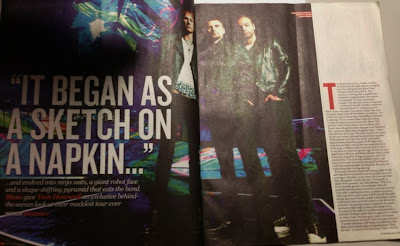
The choice of the band chosen
for the double page article are the indie rock band ‘Muse’ as they were
presented on the front cover. So they are the main band who catches the readers
attention, as they would like to read the articles of the indie rock band Muse.
They are also been placed in a futuristic background as the lights look bright
and unnatural. This could mean that this article could be about the future of
Muse, maybe about future albums and tours.
The language used in the
magazine is formal, as they know that some of their target audience are a bit
older as they have an estimate of their target audience‘s age. They also use a
friendly approach as there is strong language in the article like ‘the whole
thing looks fucking amazing.’ That shows that they are comfortable enough with
the reader that they could swear and it also shows that others words can not
describe their ‘ridiculous’ tour. The colours used in the magazine are a bit
dull but that some bright, futuristic colours which give it a sci-fi effect. As
the band ‘Muse’ is in the middle with brightly lit lights shone on them; so
they catch the reader’s eyes of this double page article.
The style of the text is eye
catching as they want the readers to read about Muse as they are the main image
of their front cover. As they placed a big quote told by Muse aside of them.
But their interview is in the right hand side with smaller font size than the
image and quote. The reason being is that NME wanted to grab the attention from
the readers of Muse and their surroundings, is it a glimpse of their new
concert which they will be playing at.
The double page is laid out with
a huge picture of Muse in a low angle which makes them look intimidating
and mysterious,. The band members are wearing black leather clothing, as
that makes them look more masculine. The background looks to be in a concert
with a futuristic background lighting, which makes the reader see that their
concert will not just be any normal concert. With a big quote from Muse ‘It
began as a sketch on a napkin...’ That intentionally makes the reader wonder
what they are talking about is it about their tour or about the band in
general. They place the interview article of Muse in the right hand side.
The sort of tone the magazine is
addressing the reader is like a friendly close friend, as they are interviewing
the band Muse and would like to make the reader part of it, by making them to
get to know Muse. The band is represented as cool and macho indie/rock band.
The style of the front cover
does match the double page article as they made the indie/rock band Muse
standout and grab the reader’s attention as they are placed in the middle. The
article does not demand much prior knowledge as it is just an interview with
Muse; it’s just an article about their tour.

No comments:
Post a Comment